Join 40,000+ sales and marketing pros who receive our weekly newsletter.
Get the most relevant, actionable digital sales and marketing insights you need to make smarter decisions faster... all in under five minutes.
11 Best B2B Website Service Page Examples to Inspire You

Jul 26, 2020

Best B2B website service page examples
- Medallia
- Hortonworks
- Achievers
- Arcurve
- Hootsuite
- Domo
- iVision
- Salesforce Marketing Cloud
- WaveOC
- Cart2Cart
- Interamark
Your services page is one of the most critical pages on your website whose purpose is to not only reveal what you offer but how your company stands out from the rest.
It starts with the messaging.
Based upon the service you have; you need to figure out the best way to explain it. This could be through short sentences, long paragraphs, bullet point sections, or video.
To accompany the content, you need a beautiful design.
If your services are visual, a variety of photography/graphics accompanying the content may help put everything together. If not, icons with less elaborate imagery may be more suitable.
🔎 Related: The Ultimate Guide to Website Redesign for Businesses
While you may have a killer services page at the end of this, you then have your competitors to worry about. How can you distinguish yourself from them and prove you provide the better solution?
It’s clear designing a services page is no easy feat. So to help inspire your next overhaul of your own, check out these examples of some amazing B2B product service pages that you’ll find yourself struggling not to copy!
1. Medallia
‘We do X’, ‘We help X’, ‘We’re great because..’
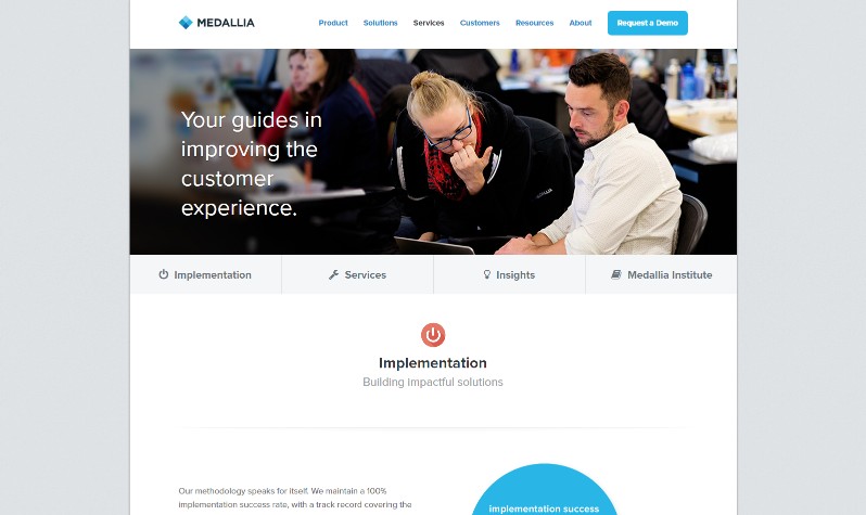
When describing the services you offer, it’s very easy to get caught up in the ‘we’. But why wouldn’t you? The services page is about what ‘we’ (your company) can do, and how great you are at it.
I challenge you to take the approach that Medallia did with there services page. Although they make sure to mention how their services will turn into the solutions for their audience, they make sure to include the reader (or the potential customer) is involved within each of the services.
Their content is written to make it apparent that the services are not one sided. Medallia intends to work with its customer as if the two are on a team (as all client-customer relationships should be).
2. Hortonworks
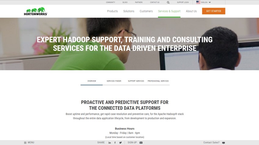
Some of us may find our services a bit difficult to layout on one services page. There could be multiple options or different ways to customize, and seeing these choices all at once may appear overwhelming for an average website visitor.
What I discovered on Hortonworks is they have a large table consisting of multiple services and features compared across one another. I, for one, was a bit confused, but maybe it's what Hortonworks audience needs!
The company came up with a clever solution to help visitors find the service they’re looking for. After giving a brief description of its services on the main overview page, users are met with a ‘What kind of support do you need?’
3. Achievers
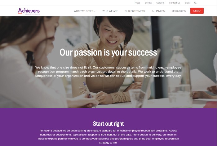
Although we feel compelled to list out every service and feature on the services page, your particular audience may not care.
Customers want to see the value. How will all this work, these services, translate into tangible ROI that proves you were the solution?
Achievers wanted to make sure they addressed this question property on its services page. They address the results they measure and back up there services with customer statistics to prove what they do works. If other customers are pleased, why wouldn't you be too?
Sometimes sprinkling in what customer success looks like on your services page is a great aid in convincing users that your solution are right.
4. Arcurve
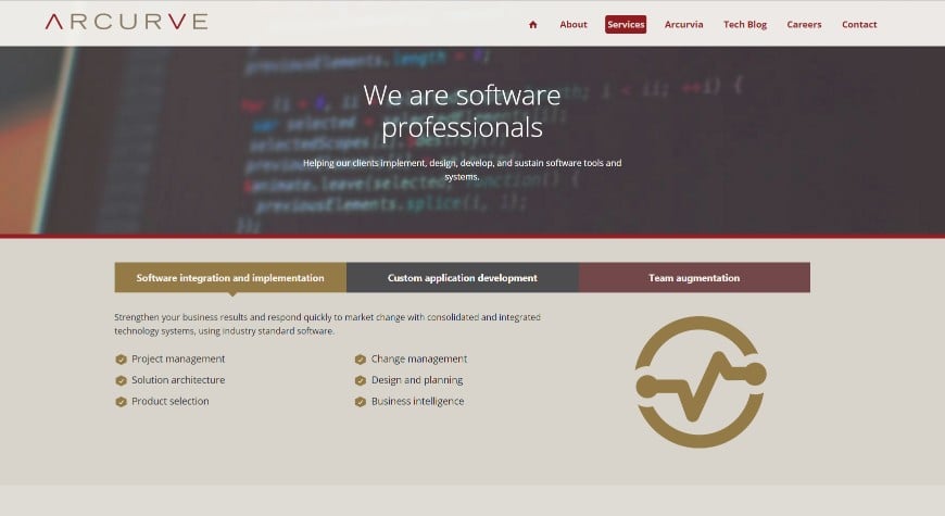
It’s never necessary to fluff up your services and make them seem complicated. Just tell your audience how it is like Arcurve did on this previous iteration of their services page. (It has since been changed.)
They’ve conveniently divided each of their services up into different sections that can be toggled between as to not significantly lengthen the page. After reading these, the user knows exactly what the company does without feeling confused or mislead.
Arcure also adds in some awesome case studies and color coordinates them with the services they provided for the customer. This is a great way to further nurture your leads so they can now look at the stories that match what services they are interested in all on one page.
5.Hootsuite
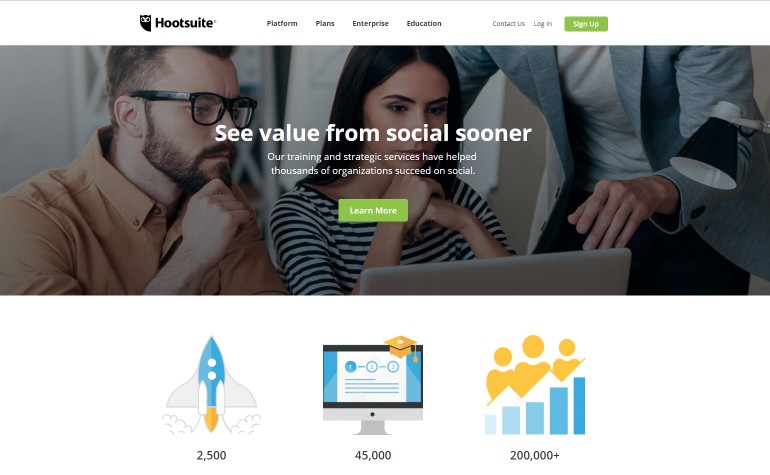
Many of us talk about how our services can impact the present without acknowledging how they will continuously ensure your customer's success in the future.
They used their training services page to address the stages its team implements and executes to show that the journey doesn't stop, but instead, evolves into monitoring and continuously improving their customer's success.
To put
6. Domo
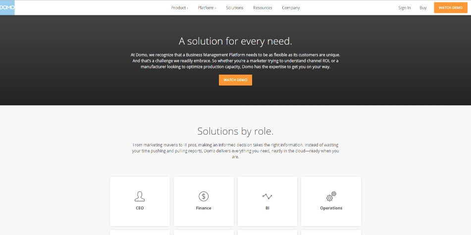
For some, your services page could be a great place to segment the visitors by their role, industry, platform, job title, etc. Domo did just that on its solutions page (which I still consider being a variation of a services page).
This approach not only enables Domo to analyze the quantities of people picking each of these choices, but it helps tailor their solutions as well. If they know its site isn't getting business from those in the healthcare industry, maybe it’s a vertical they shouldn't try to aim for. Or, they may find manufacturing to be the best industry they attract which could open an opportunity for improvements in their product.
This approach to user segmentation enables each user group coming to the website to have a more catered experience as they determine whether or not Domo solves their pain points.
7. iVision
Sometimes you’ll find yourself overwhelmed with the amount of services you offer and you may struggle to know how to outline them for your users to understand.
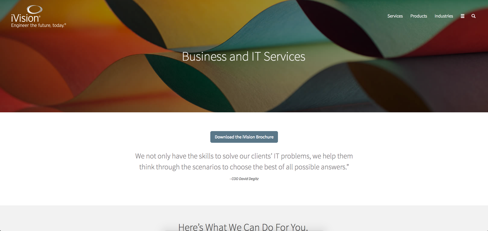
iVision knew exactly what to do when they were assembling their services. They organized them under three categories which contain the sub-services within each. This approach allows users to easily see exactly what iVision can do while giving them the option to further explore the services on separate pages.
Framing the services are two quotes, one coming from the COO, and another which seems to be from a client. Getting your company’s voice and social proof on the page not only adds personality, but evidence that both you and your clients believe your services truly help (while also increasing conversion rates).
Another interesting element is the option to view a brochure. If they know their audience prefers more tangible takeaways they can pass along to executives, or, prefer to work old school when analyzing services, this layout choice can be helpful.
8. Salesforce Marketing Cloud
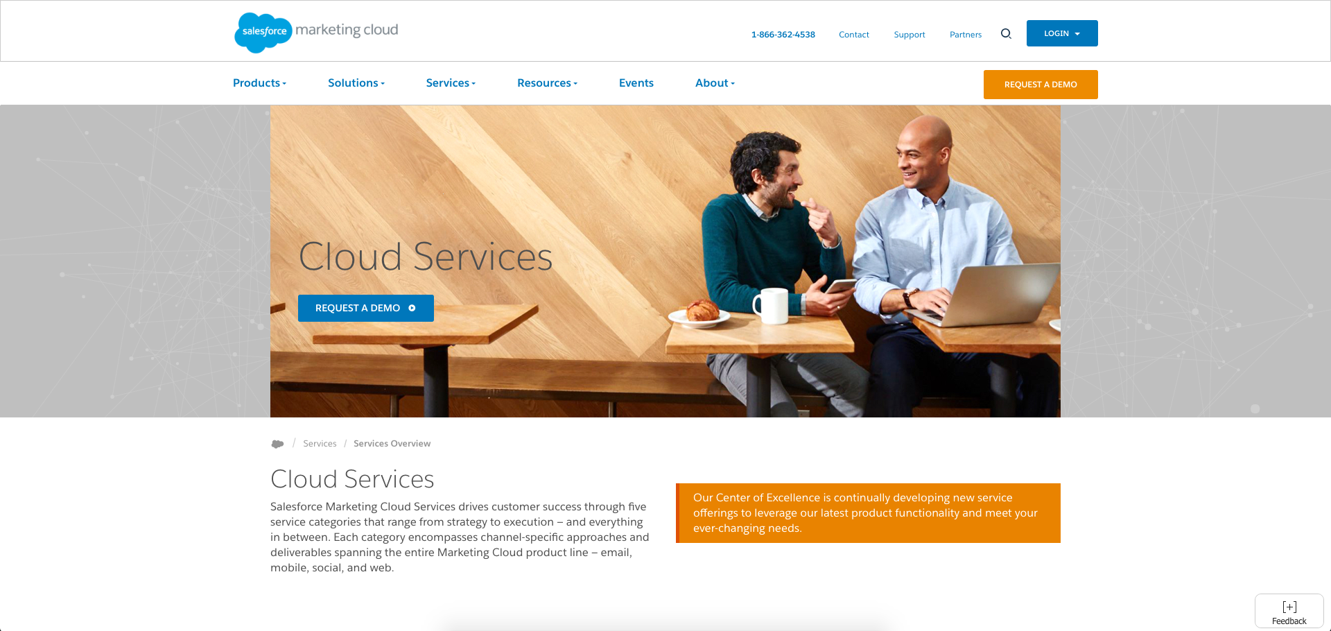
Salesforce Marketing Cloud services overview page does a clean job of showing their service categories without overwhelming the user with too much information.
In this case, Salesforce has decided to keep their services overview lean and make their solutions & success stories a bit more robust so users can see for themselves how companies like their own can find success in the product.
Using the orange on the paragraph to the right (the same orange used for the ‘request a demo’ button in the nav) helps draw the user to the content. Reading this content assures the user that their product will always be up to date and is constantly evolving to suit their needs.
9. WaveOC
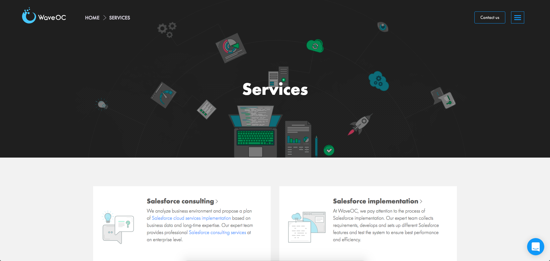
Unlike the previous two examples, WaveOC took a much more visual approach to their services page by adding in graphics for each service option to add context to each option, before you even start reading.
Each option provides a more comprehensive overview on separate pages so users can get the gist of what WaveOC offers before deciding if they need more information.
One element WaveOC incorporates onto their site which hasn’t been seen on the others is the ‘advantages’ section which lets users know why WaveOC is a better choice than others.
If you have any questions concerning anything you’re reading, there's a little live chat widget in the bottom right-hand corner, which allows you to immediately talk to an employee without having to be put on the phone with a sales person. These sorts of tools help you talk to potential customers who may not have otherwise converted unless they had talked to you.
10. Cart2Cart
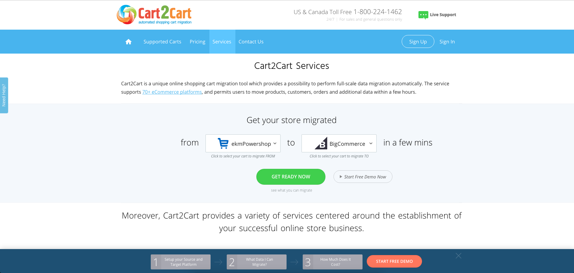
Before going into the variety of services they offer, Cart2Cart put a section which visually shows you what their software has the ability to do - migrate your store from one platform to another. This initial CTA gives users an exact idea of what they can expect and whether or not the store options they’re looking for are available.
Once users are able to play around with that tool, they can continue to scroll down and reveal the other services that will help users businesses succeed. The use of background color allows each section to stay segmented from one another so users know what content and images are connected.
The last element I was impressed by was the blue step-by-step bar at the bottom of the screen to receive a demo.
The first step allows you to select the stores you're migrating with, while the second step directs you to a page which shows you exactly what will be migrated over, and the third step discloses the cost.
Functionality like this is an awesome way to show users exactly what they can expect with the product without hiding anything and giving users a very easy conversion path.
11. Interamark
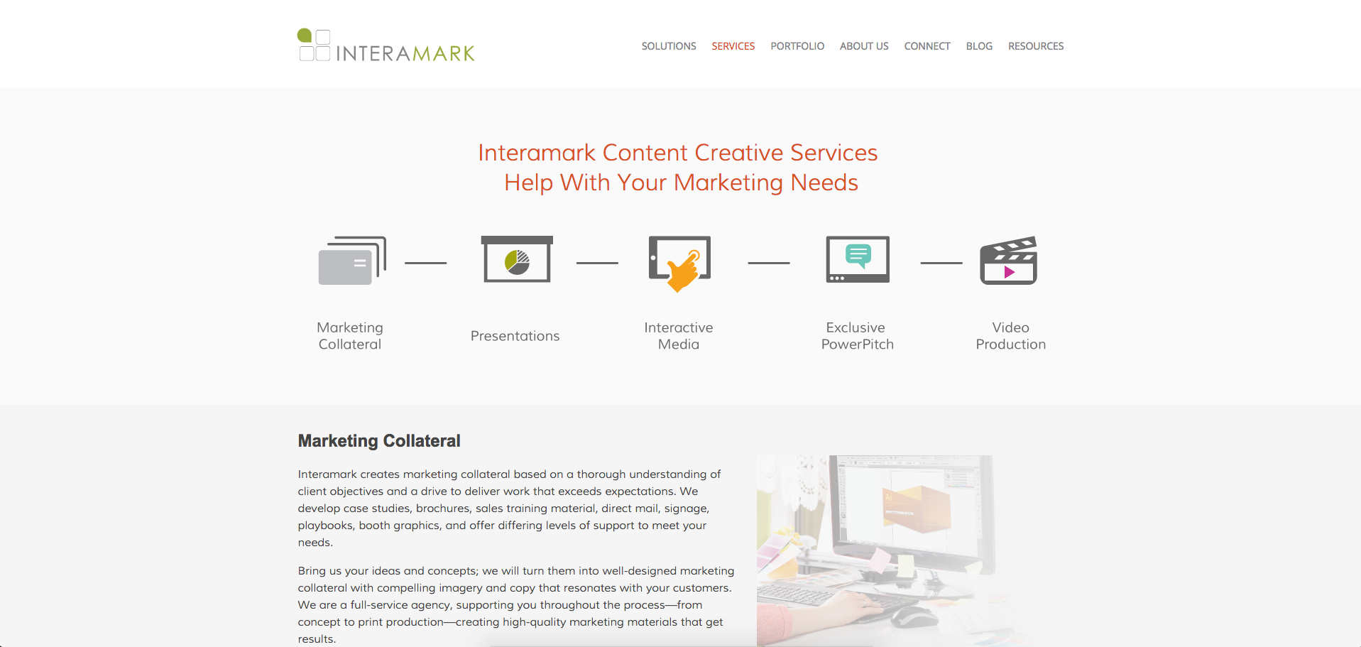
It’s critical to show your user all the services you have as quickly and efficiently as you can, so users don’t have to scroll down the page searching for it. Interamark managed to do this by laying out icons and small headers with all their services above the fold so users know exactly what to expect as they scroll down to read more.
As they expand upon each of the listed services from above, the sections give users the option to read more or view examples so they can see exactly what they can get.
For those who may fully be ready to move forward with Interamark, there is a CTA which appears in the middle of the page so they still have the ability to capitalize on possible missed opportunities.
Free: Assessment
